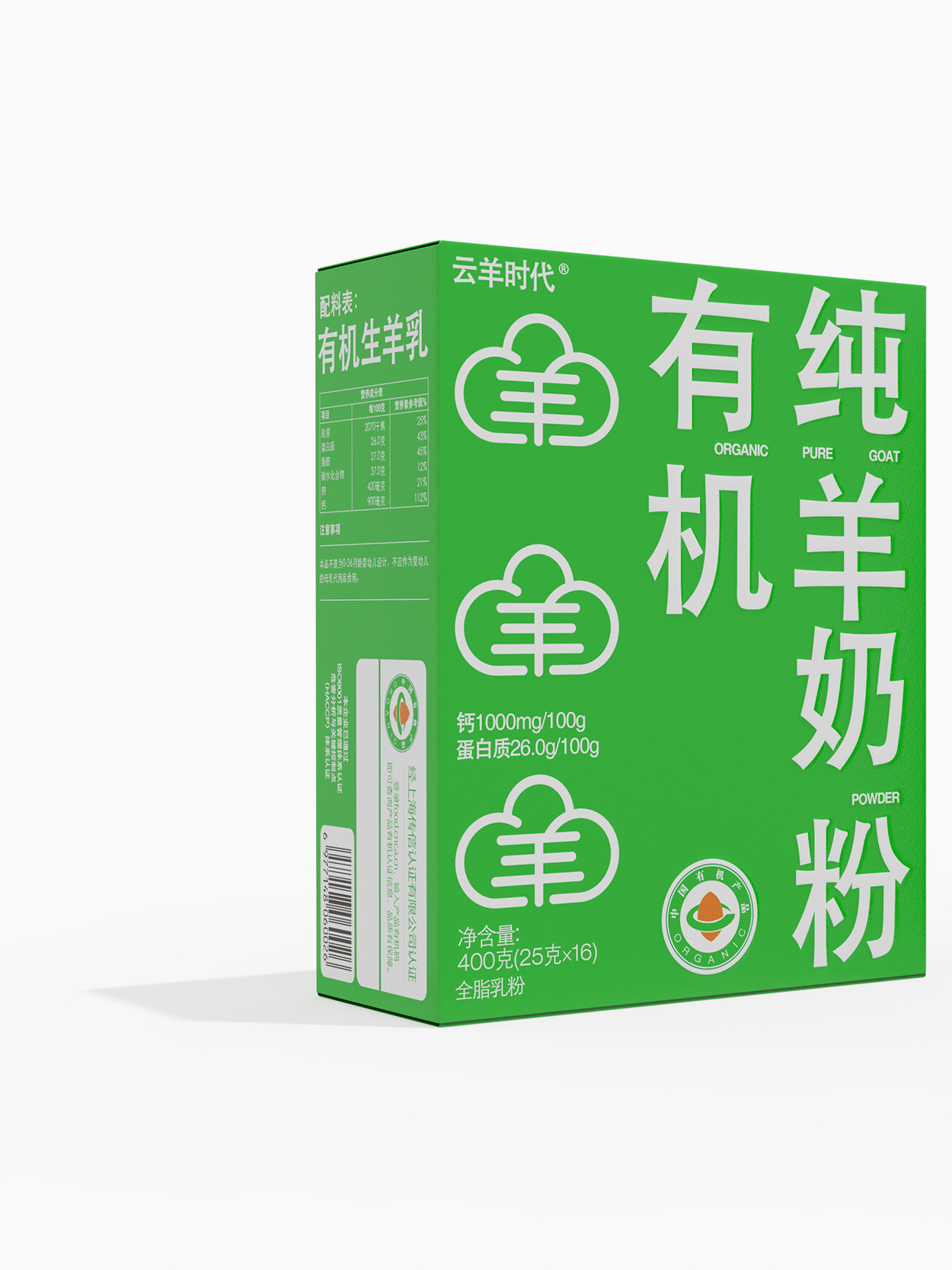
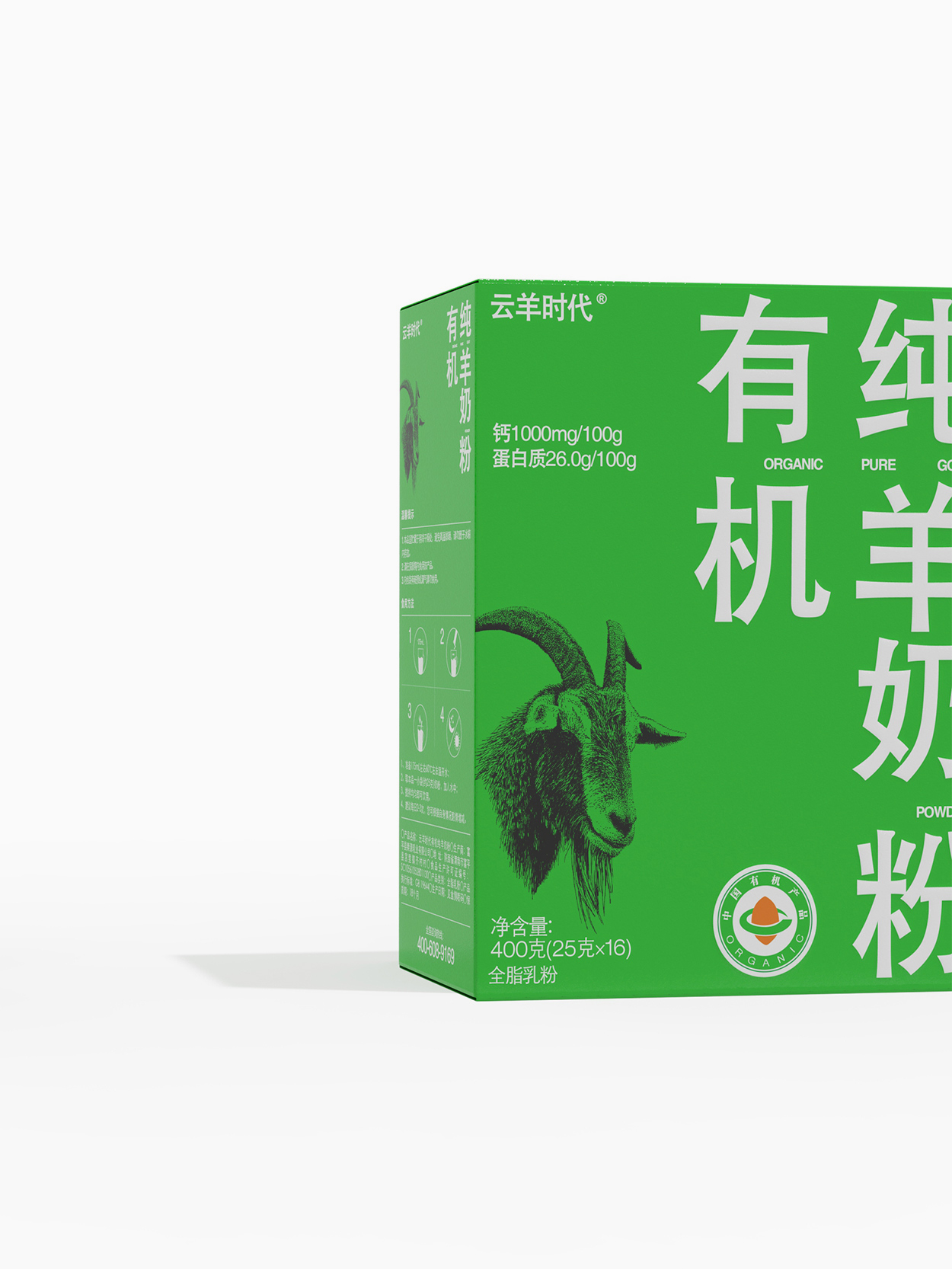
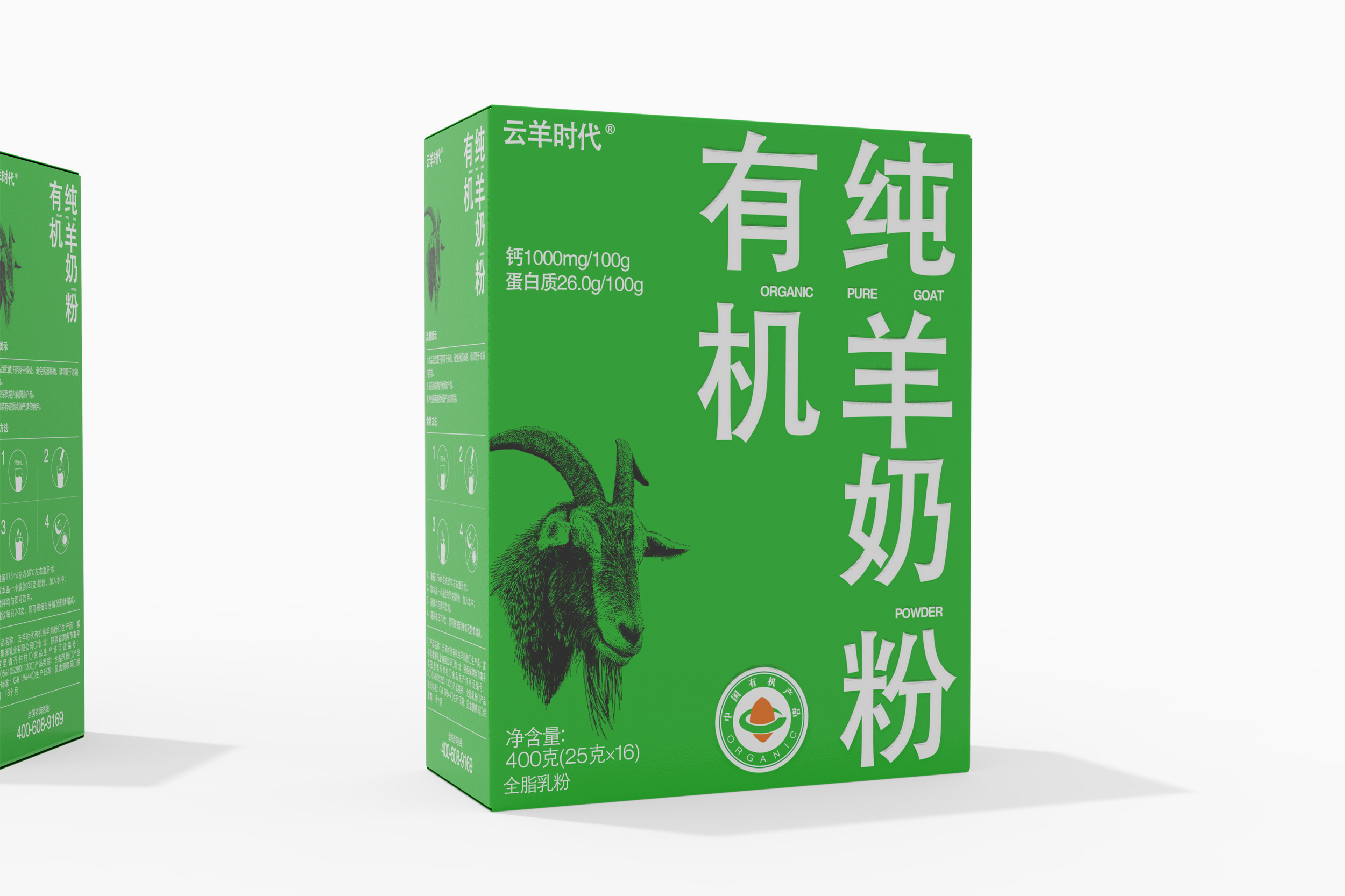
The packaging design of Yunyang Era Pure Goat Milk is inspired by international design styles, highlighting a large font format that is simple and pure. Through vivid color combinations and minimalistic design elements, it showcases the authenticity and high-quality characteristics of the product. The use of a large font makes the overall packaging more intuitive and easy to understand, emphasizing the pure goat milk nature of the product, allowing consumers to instantly grasp its features. The design style is clean and minimalistic, emphasizing the concept of purity, showcasing the product's high-end positioning and unique charm, and providing consumers with a fresh visual experience and purchasing motivation. This packaging design aims to pique consumers' interest in pure goat milk products, emphasizing their pure and healthy image, reflecting international design standards and a pure product concept.