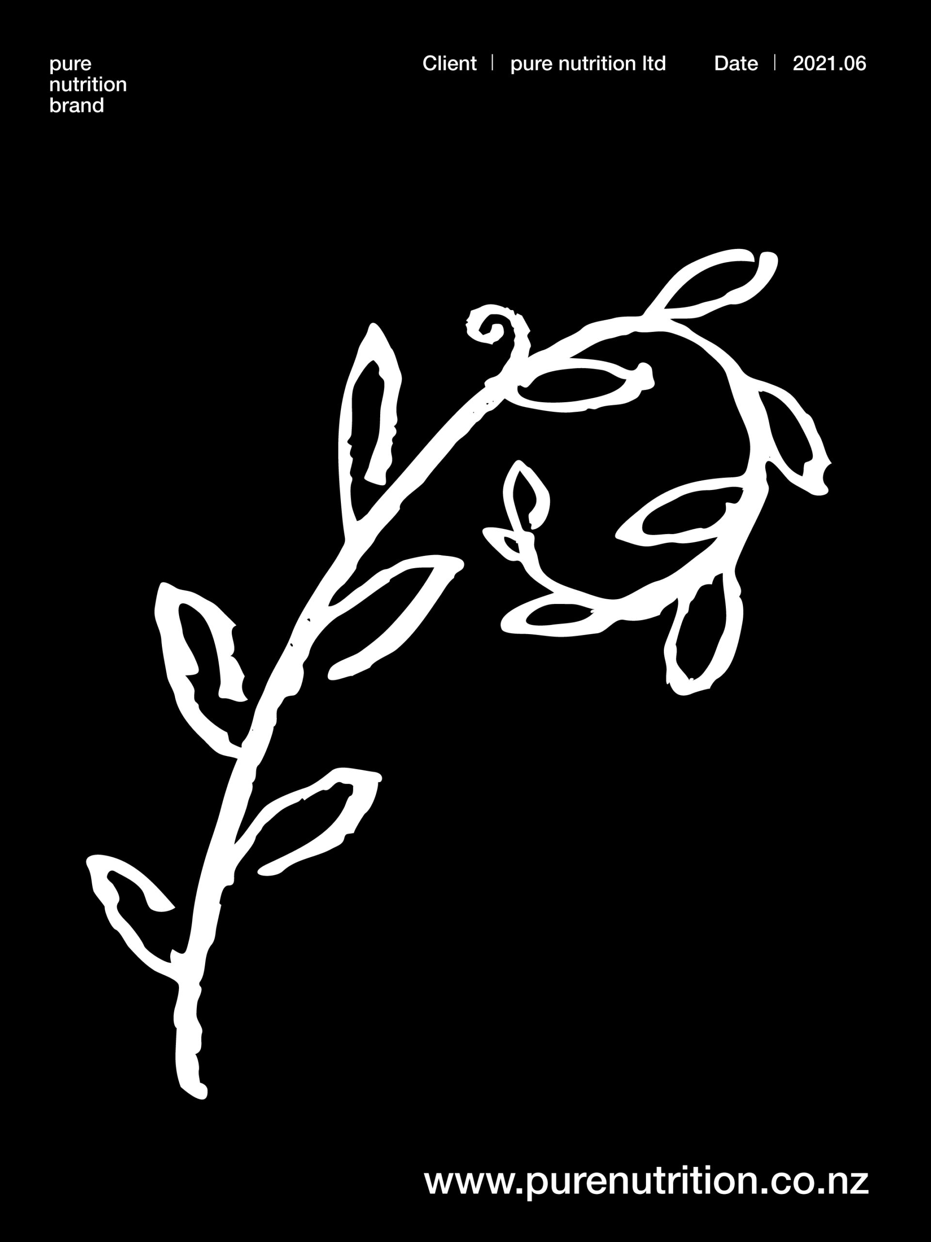
In the visual language of the PURE NUTRITION logo, we can observe a set of highly international visual elements, specifically the first letter "P" from "PURE." Through the evolution of its graphic form, it effortlessly captures the audience's memory.
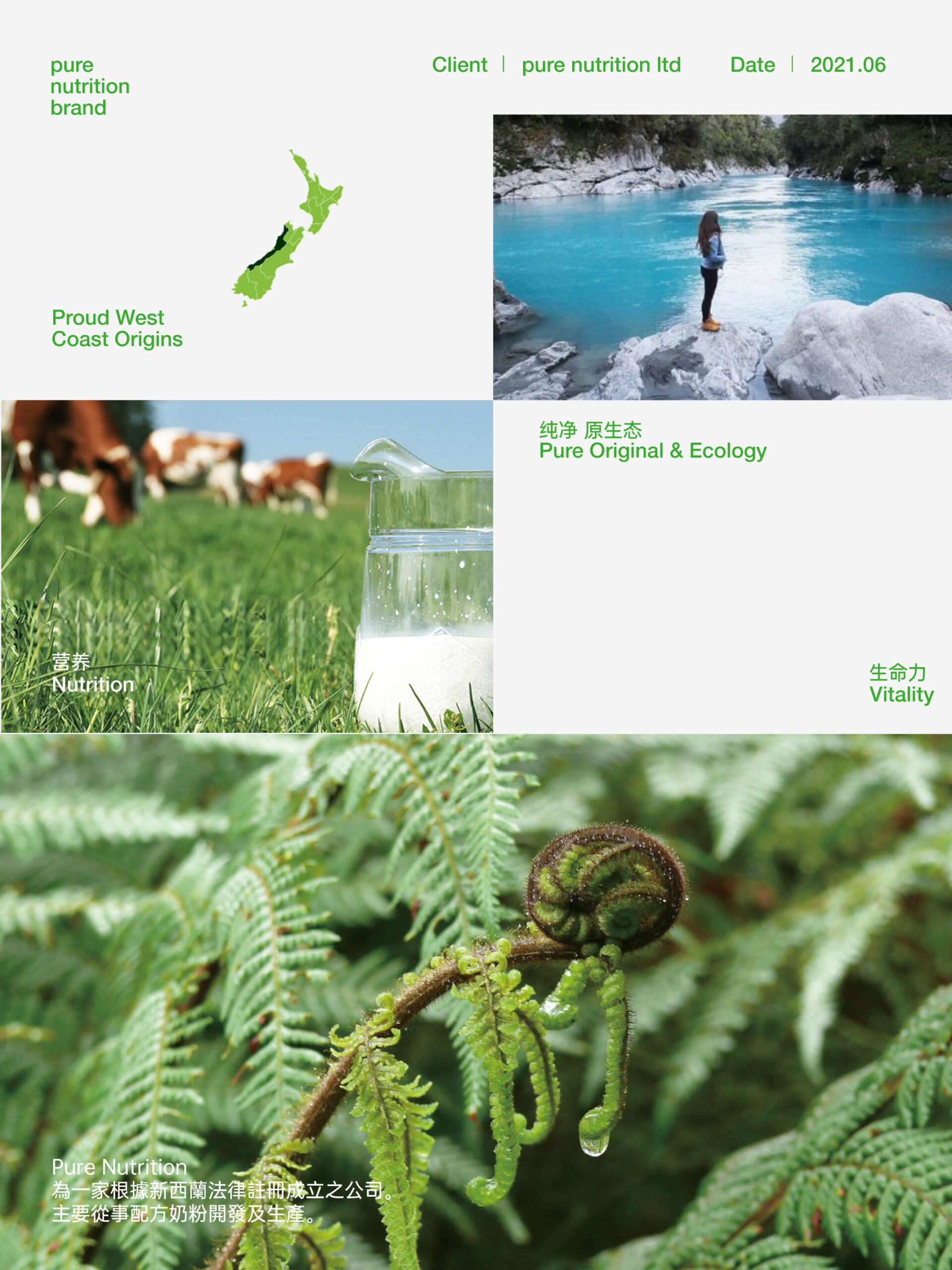
The brand attributes of "PURE NUTRITION" are closely linked to the concept of "green nutrition." To integrate this unique characteristic, the letter "P" is ingeniously transformed with the concept of modern technology, aiming to achieve a sense of industry-specificity while maintaining a strong approachability. The logo is steady, grand, stylish, and contemporary, and it is closely connected with a strong sense of quality and corporate philosophy. Green is the color of technology and modernity, which can create a comfortable feeling for people. The use of this color scheme here further immerses the audience in an atmosphere of safety, reliability, and trustworthiness.