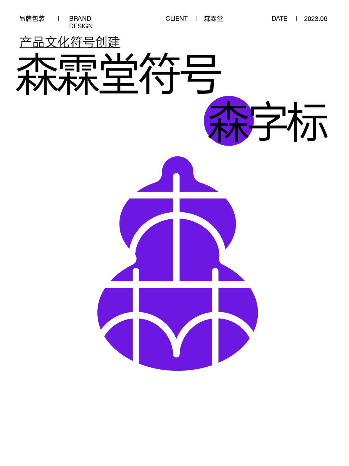
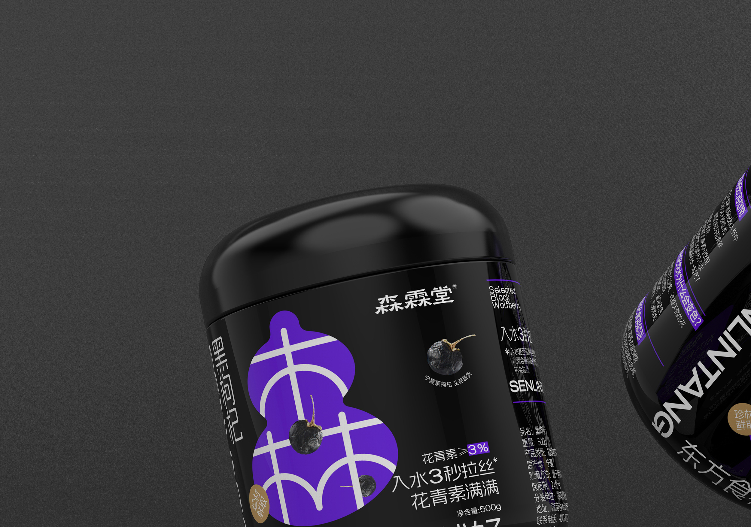
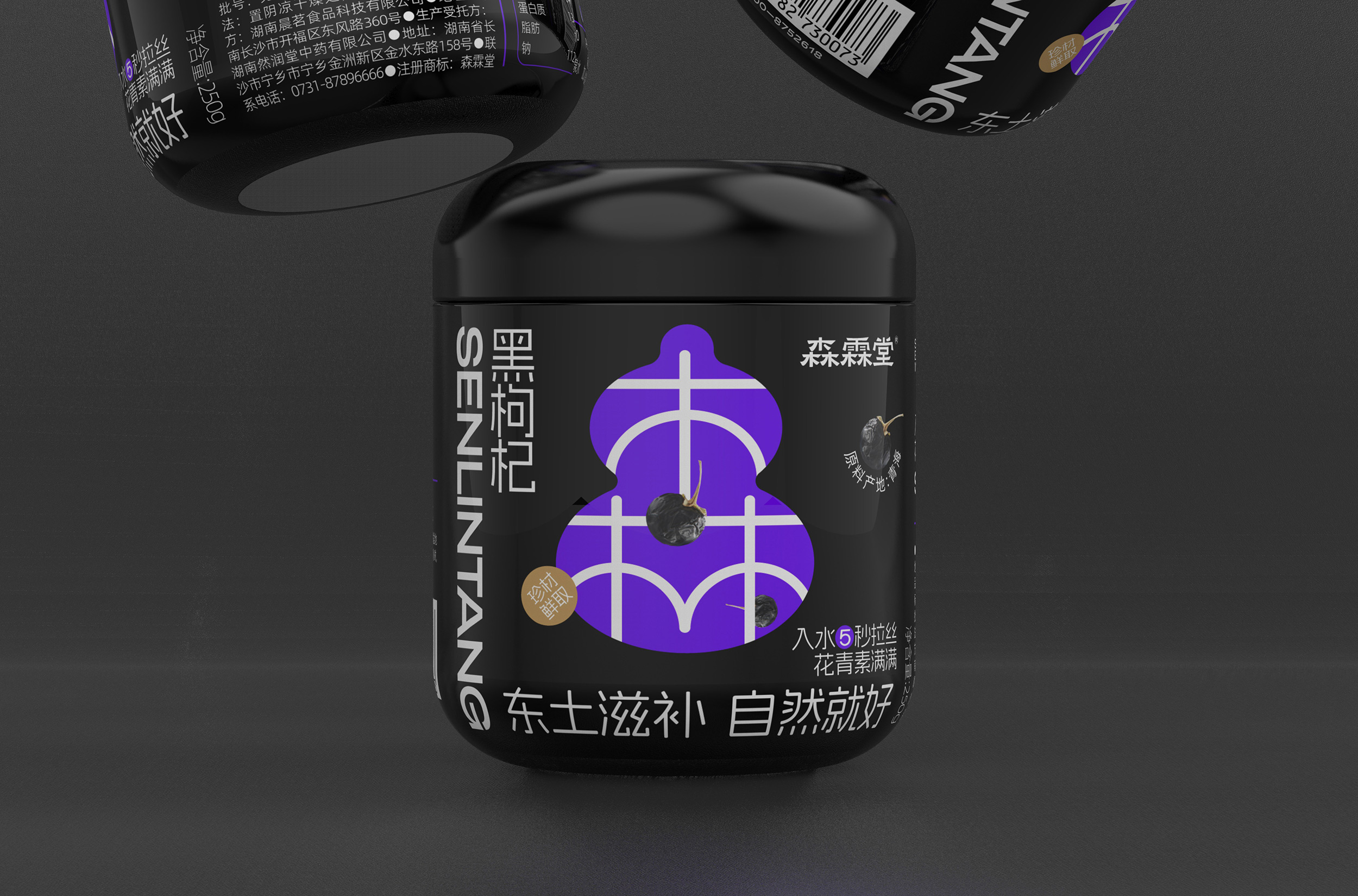
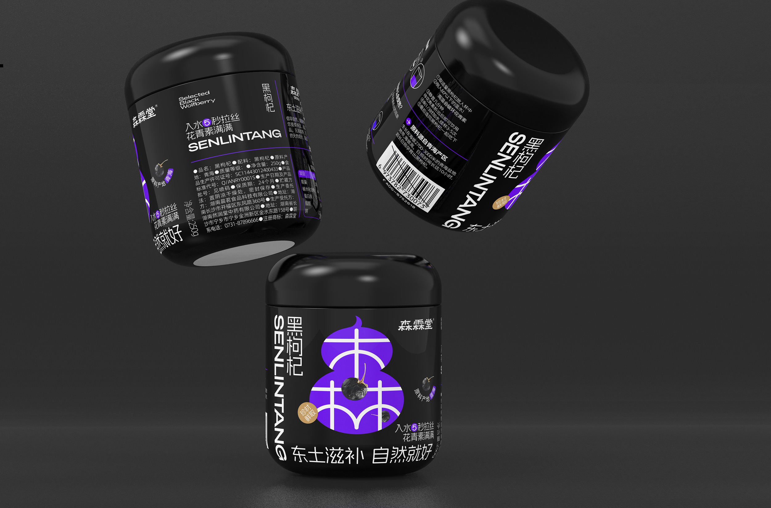
In the cooperation with Hunan Senlintang Medicine, the most discussed topic with clients is user identification. Identification is a very abstract concept. What are the boundaries between "effective identification" and "ineffective identification," and how should they be conveyed to users? In the process of sorting out the content of Senlintang's brand, we discovered a unique and highly recognizable symbol - the gourd. The "gourd" can be used as an implicit annotation for "health" and as a prominent identifier for the brand. Moreover, the application of this large color block symbol effectively conveys Senlintang's brand proposition - health and nourishment, derived from the oriental dietary supplement lifestyle.