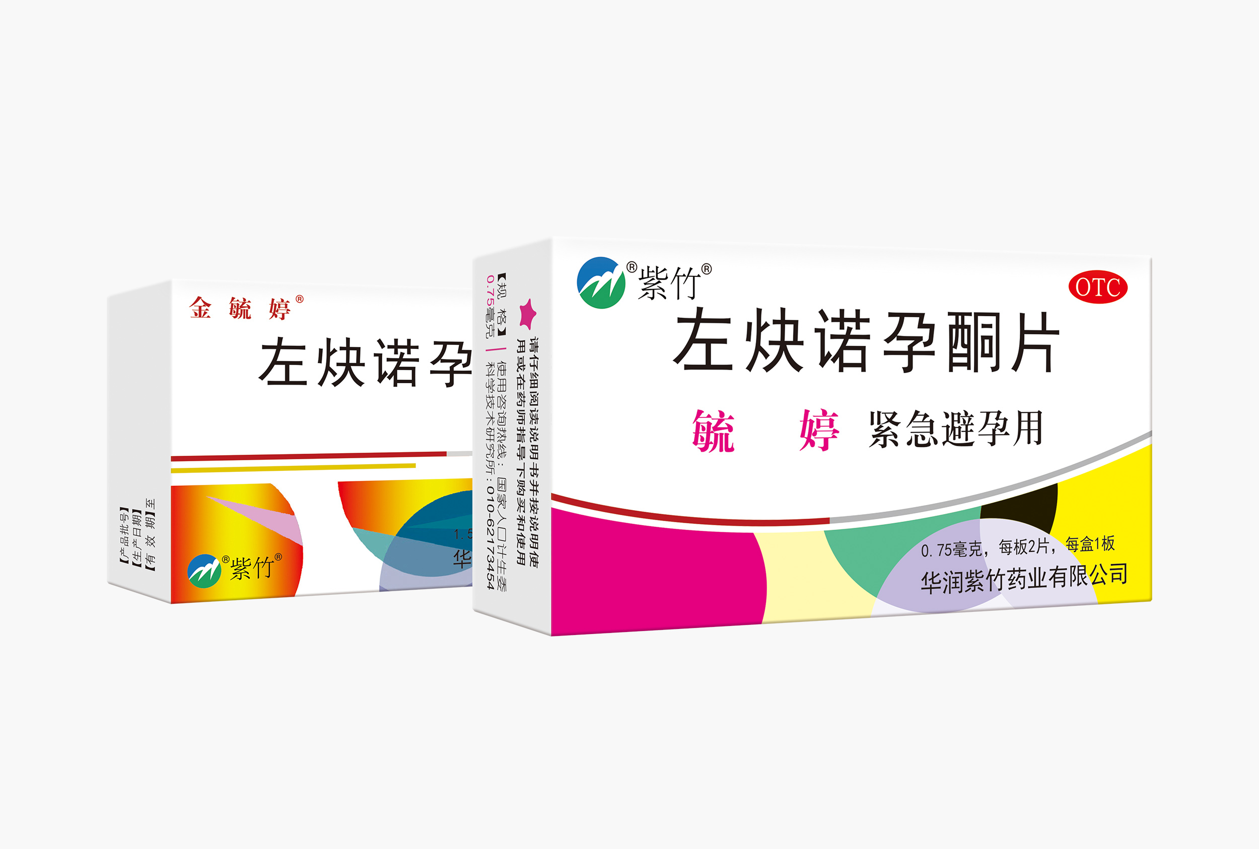
This packaging adopts a clean style, mainly white, to reflect the purity and professionalism of the medicine. The box is a rectangular prism, convenient for storage and carrying.
Drug Name and Brand: The front upper left corner features the drug name "Levonorgestrel Tablet" in large, bold black font for easy identification. Above it, the brand name "Jinyuting" is written in golden font to enhance brand recognition.
Usage Identification: Below the drug name, "for emergency contraception, 1 tablet" is marked in a smaller font to clearly indicate the drug's purpose and dosage.
OTC Mark: A red "OTC" mark is placed in the upper right corner, showing that this is an over-the-counter drug and facilitating quick consumer judgment during purchase.
Decorative Elements: A decorative belt in red, yellow, blue, green, and other colors runs through the middle, adding visual appeal. Below it is a colorful geometric pattern, further enhancing the artistic feel of the packaging.
The side of the package lists the drug's approval number, production date, and expiration date in a small but clear font to meet regulatory requirements and ensure consumers can access basic drug information.
Production Information: The bottom of the back side displays the name of the manufacturing enterprise, "Hualan Zizhu Pharmaceuticals Co., Ltd.," along with the enterprise logo "Zizhu," which is composed of abstract mountain peak patterns in blue, green, and yellow, symbolizing the company's philosophy of nature and health.
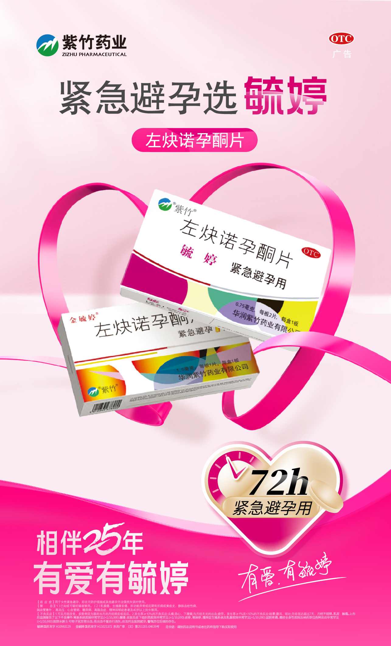
Other Information: The back also includes detailed drug explanations, such as ingredients, indications, usage, adverse reactions, and contraindications. However, due to image limitations, the specific content is not fully shown here.
The packaging box is made of cardboard, providing good hardness and wear - resistance to protect the medicine during transportation and storage. The printing is fine, with high color reproduction, clear text and patterns, and a good overall texture.