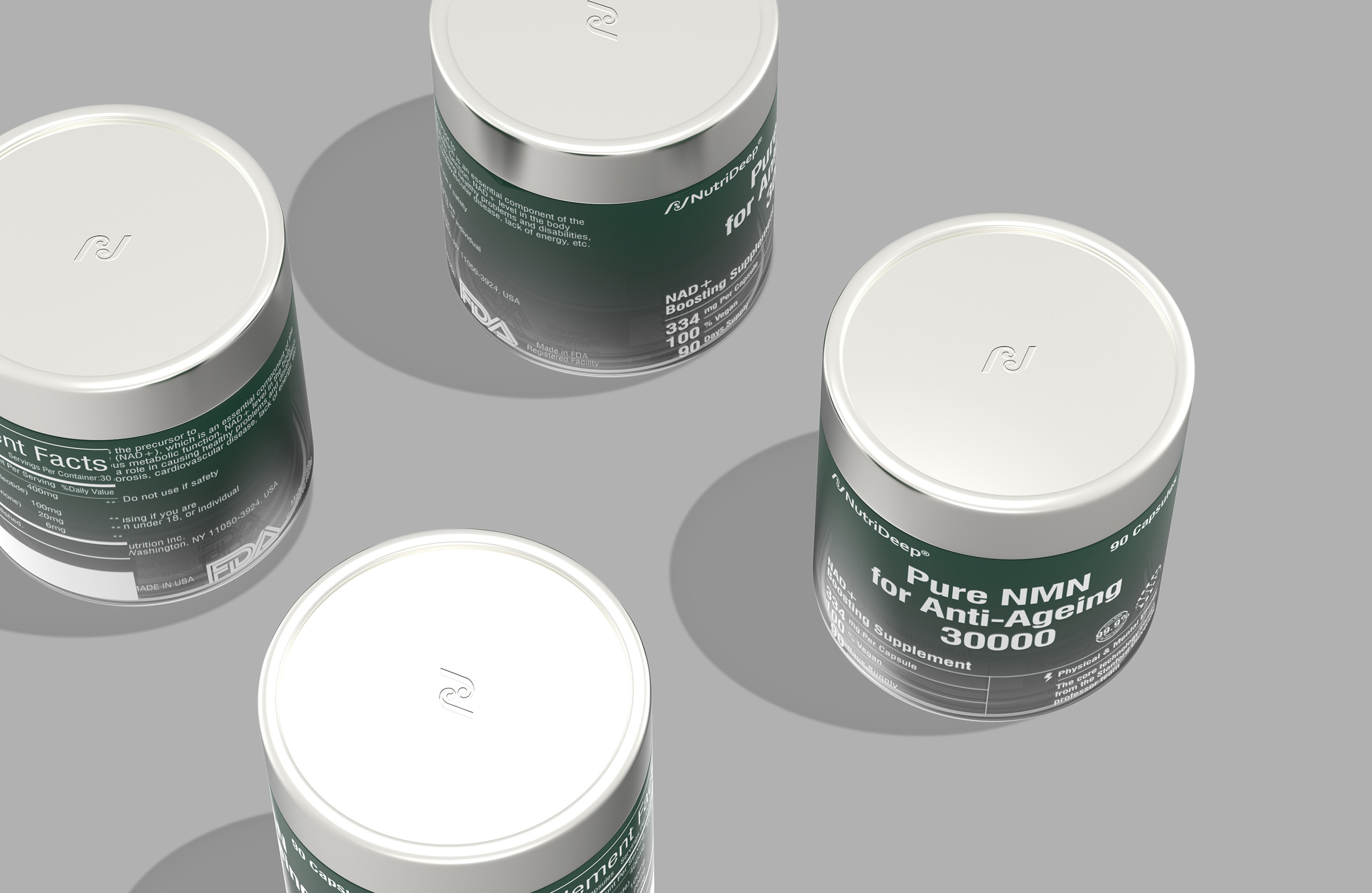
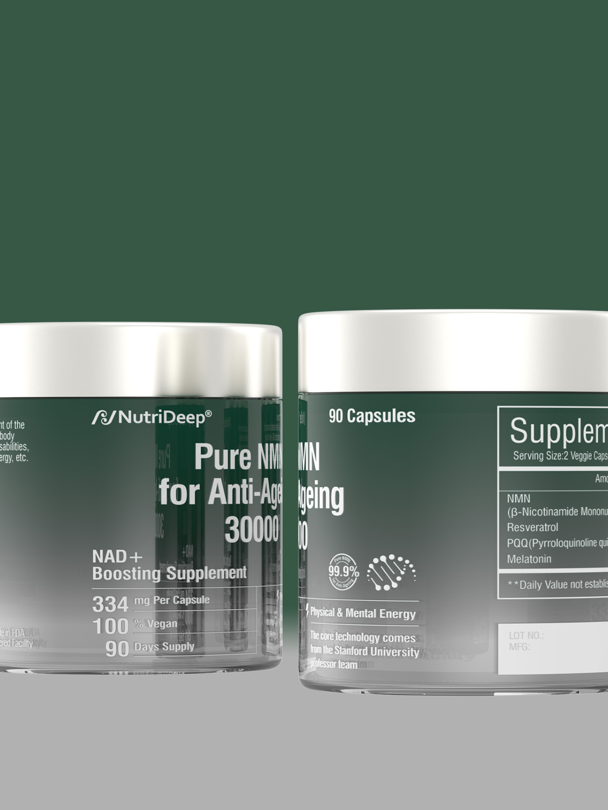
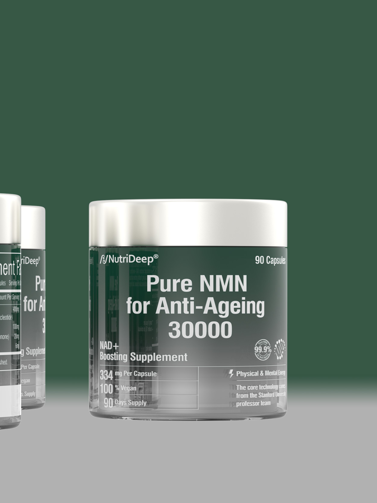
How to effectively create a trustworthy sensory experience for a new brand. First, we look for possibilities in the skincare and fashion industries to make the design appear both high-quality and aesthetically appealing. We have established the color scheme for NutriDeep, using a combination of green and gray, which is significantly different from other similar products on the market, to form the visual core of NutriDeep. This not only aims to make NutriDeep's products more distinctive, but also to create a sense of trust and reliability for consumers. Secondly, in font selection, we have chosen reliable and conventional typefaces to make consumers feel more familiar and connected.